相關(guān)服務(wù)
載體構(gòu)建質(zhì)粒DNA制備
病毒包裝服務(wù)
mRNA基因遞送解決方案
CRISPR基因編輯解決方案
shRNA基因敲低解決方案

While sequence alignments allow for visualization of individual matching nucleotides, it can mask some larger-scale features of DNA or RNA sequences, including repeats and inversions. Dot plots show sequence alignments on a two-dimensional plot, where one sequence is placed on the X axis, and the other on the Y axis. Analysis occurs by aligning a portion of the sequence based on window size (default is analysis every 10 bases), and if the mismatches are at or below the limit (default limit is 0), the tool will place a dot at the aligned X and Y coordinates. This allows for each set of 10 bases to be independently compared against the query sequence, highlighting more complex relationships. For instance, reverse complements can be visualized as green dots and repeats appear as multiple stacked diagonal lines. Dot plots are often used to identify regions with direct or inverted repeats, frameshifts, inversions, and low complexity within a sequence by aligning it against itself.
When studying differences between genes, proteins, or organisms, sequence comparisons can help to predict structural relationships, functions, and evolutionary changes. Standard sequence alignments compare each nucleotide to similar positions on the query sequence, and it is possible to see mutations, insertions, and deletions on the scale of individual nucleotides. However, other changes including inversions, repeats, and translocations cannot be identified using this approach.
Dot plots are a form of alignment that provides a more global perspective using a matrix output. One sequence is placed along the x axis, and the other along the y axis. Regions of each sequence are compared to the entire query sequence, based on the window size. VectorBuilder’s Dot Plot tool has a default window size of 10, so each set of 10 base pairs is aligned to each region on the query sequence. The mismatch limit determines what is considered “aligned,” and our default setting is 0. If the set of 10 base pairs has 0 mismatches with a section of the sequence, then a dot is placed at the appropriate x and y coordinates. When aligning a sequence to itself, you will typically see a straight diagonal line (Figure 1).
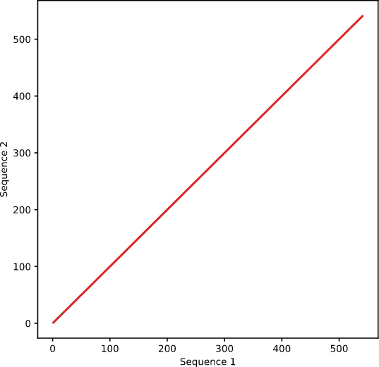
Figure 1. Sequence aligned to itself.
Adjusting the window size and/or the mismatch limit will change the stringency of the alignment. For instance, changing the window size to 5 will mean a higher likelihood of alignment at any given point (Figure 2). This will increase the background in the output, but may highlight more subtle or divergent changes.
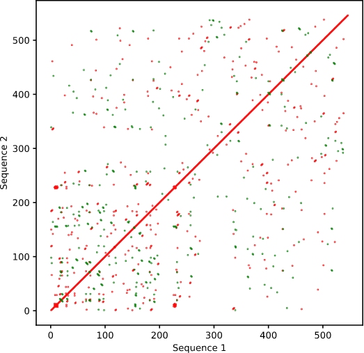
Figure 2. Sequence aligned to itself with window size of 5.
Changes that can be observed in sequence alignments can also be seen in this wider perspective, though in less detail. Individual mutations that exceed the mismatch limit will appear as a blank space in the line (a), while deletions and insertions will cause the line to shift (b and c, respectively) (Figure 3).
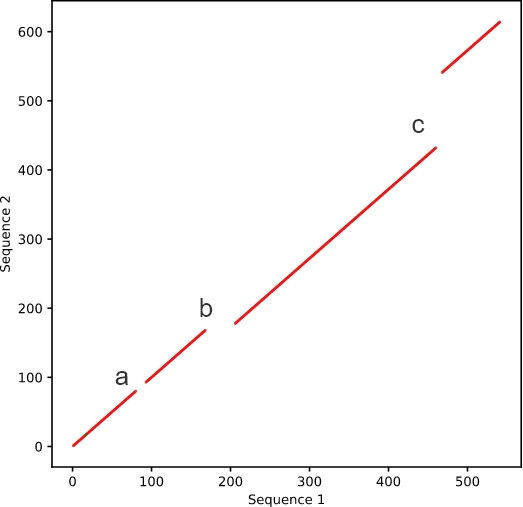
Figure 3. Sequence with mutations and indels.
A major benefit when using dot plots for alignment is the ability to observe changes that occur across sections of the sequence. Repeats within a sequence will not be highlighted in a standard sequence alignment, but because dot plots align a section of the sequence to the entire query, all areas of alignment are noted. Regions that contain repeats appear as stacked diagonal lines (Figure 4).
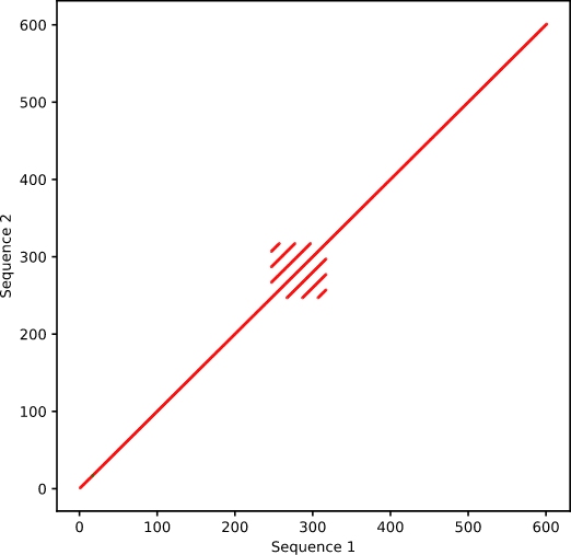
Figure 4. Alignment of sequence with itself, containing internal repeats.
Other individual events that can appear as divergence on standard alignment can be appreciated using dot plots. Sequence translocation will show no relationship between the corresponding regions in a sequence alignment (Figure 5A), but will be highlighted on a dot plot (Figure 5B).
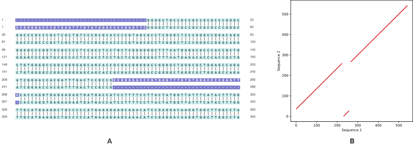
Figure 5. Sequences with translocation compared using (A) standard sequence alignment and (B) dot plot.
In addition to “cut and paste” movement, sequences can exhibit inversions or inverted repeats. The latter is utilized in a variety of cloning techniques, including shRNA design. As with translocations, this change appears primarily as mismatches in the Sequence Alignment tool (Figure 6A). However, dot plots allow visualization not only of the forward sequence alignment, but also that of the reverse complement. Red lines show forward alignment, and green show the reverse complement. Here, the green line highlights where an inversion has occurred (Figure 6B).
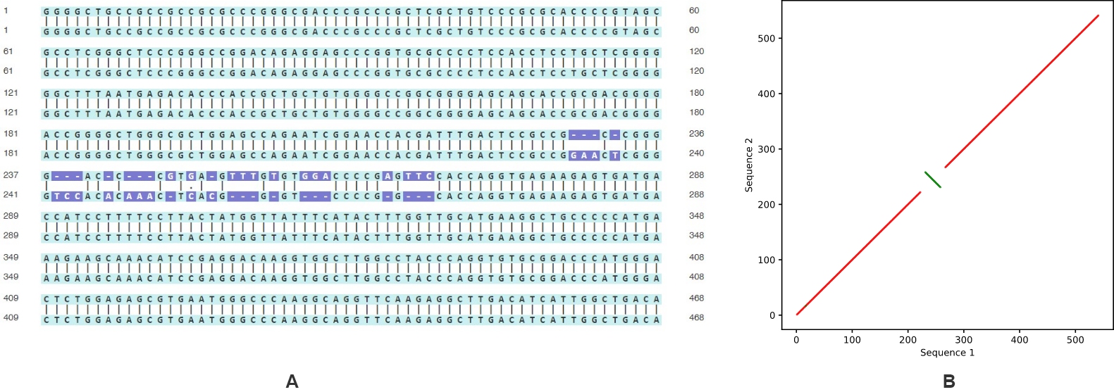
Figure 6. Sequences with inversion compared using (A) standard sequence alignment and (B) dot plot.